Photo Essay Based on “Philosophy” by Ben Folds.
Photo Essay
November 19, 2008Critique – United Colors of Benetton
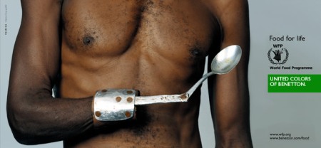
November 19, 2008United Colors of Benetton, a clothing company has partnered with various organizations throughout its history to promote social justice and address world issues. For one of its campaigns, it teamed up with the World Food Programme to create the “Food for Life” campaign.
The basis for this campaign, its pitch, is that one cannot escape perils like poverty, ostracism and violence without first obtaining food. Without the basic human need of food and nutrition, one cannot even begin to think and act to lift themselves up from their dire straits. In parterning with the World Food Programme, a UN affiliate to alleviate world hunger, the United Colors of Benneton hopes to appeal to a group of people who are desirous of social change. Showing that their company, too, is desirous of social change will attract a larger consumer base to buy their products.
One of the images used in this persuasion campaign depicts a black man, with a nude torso, amputated hand, and a makeshift prothestic hand composed of a wristplate, extension bar and spoon. The man while not completely emaciated, does look rather skinny and is in sharp contrast to the neutral grey background of the image. Copy on the right side of the ad reads “Food for life” with the World Food Programme logo just above a white “United Colors of Benetton.” on a green field. Smaller, and in the bottom right hand corner are the websites to the WFP and UCB. All text in this ad is formatted in the strong and neutral Helvetica font.
Aristotle has written that for an argument to be persuasive and effective, there needs to be shown an ethos, logos, and pathos. The ethos, or credibility, of this ad is found in its simplicity of a photograph. It depicts a man who looks untouched and natural – apart from his realistic looking amputation. The viewer is not given the opportunity to question whether or not the man in front of him actually exists; the man in picture is the same man as was in front of a camera once, live, in person. The logos, or logical steps, to this piece are somewhat more complicated. First, looking at the black male subject and reading the copy gives an indication of location and origins for this piece. Much of the World Food Progamme’s efforts have been made in Africa. So logically, this black male is supposed to represent a male in Africa. Next, the abnormal part of the man is his amputated hand. Knowing that this man is supposed to represent an African male, and drawing knowledge about the political and civil instability in Africa, one can conclude that the male in the ad lost his hand to a land mine or out of some form of ethnic violence. Finally, the amputated arm is replaced with a prosthetic spoon. The logical conclusion says that this African man, crippled by violence still has to eat, and since his hands are gone, he must make do with a prosthetic spoon. This really is where the Pathos, or emotional appeal to the argument comes out. As a viewer looking at this advertisement, one sees that there are people in this world who live in horrible conditions; who cannot even eat normally because violence where they live. The idea of buying clothes when others are starving becomes a thoughtless idea. Instead, United Colors of Benetton wants the viewer not to just buy clothes from them, but to support the World Food Programme. United Colors of Benetton is so thoughtful as to provide an easy way to do this: by shopping in their stores, and perhaps donating some money to the WFP.
This image is highly effective and does indeed alter the viewers perceptions. What is at first made to look like an appeal for humanitarian aid, is actually an advertisement to sell a clothing line. We are coerced into feeling good about buying clothes when others are starving.
Photo Construction Essay
November 12, 2008Recreation of Eggleston’s Truck
November 12, 2008Critique of Sontag’s “On Photography”
November 12, 2008The essence of photography is one that emphasizes reality. It is, in a sense, a reflection of life or an object through the lens of a camera and printed or dispersed to a wide audience. In her essay “On Photography,” Susan Sontag explores the relationship between photography and reality, and the art form’s major goals.
What is the purpose of art? Is it supposed to reflect reality, or comment about it? Should the collective cult of photography try to capture the world as it is, or should the world’s collection of photographs document and record what is not available or accessible to the general public.
Sontag references Walt Whitman’s collection of poetry, “Leaves of Grass,” which unlike previous poetry movements, really emphasized the physical world and man’s relationship to nature. It is fitting then, that Sontag relates his wonder and amazement of the physical realm with the construct of photography. She describes two ways in that photography represents the world: through an examination of the norm, and through studies of the abnormal, the variants. These two types of examination are used in all kinds of work. One can identify and describe the mean, the average, or one can identify the outliers, what is unknown to the general public.
In particular, Sontag comments heavily upon the work of Diane Arbus. Arbus’s work entails the extremes of human condition. She photographed midgets, freaks, nudists, and giants. She took pictures of the ugly side of human nature and sought to make it beautiful. Sontag identifies the evolution of the art form of photography from photos of the beautiful to photos of the real. Amateurs she argues try to find the beautiful moment in a world that is not always so, whereas an artist captures the world as it is and finds the beauty in it.
In a closing thesis, Sontag seeks to determine the value of the photograph in society. Through its original aims and goals, in finding what is particularly beautiful, she finds fault with its purposes and reality. Yet, when finding and documenting what is particularly ugly and unattractive, Sontag finds a surrealism and an appeal, which seeks to determine the American culture as one of redemption and damnation myths. We, in short, take pleasure in what is foreign and different. Photography allows us to examine these aspects without entering them, or having to get too close.
William Eggleston
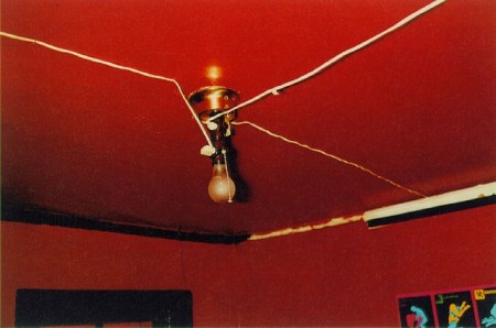
November 12, 2008William Eggleston, born on July 27, 1939, is an American photographer whose work is mainly based in color. He is considered the largest proponent for color photography as an art form. In 1958 Eggleston acquired a Leica camera and by 1965 begins to experiment with color negatives. While teaching at Harvard Univeristy, Eggleston discovered dye-transfer printing, which had until that point been used solely for advertisements. For him, the quality of the high color saturation was of interest, a break from the traditional black and white prints that had been the norm for photography as an art form. This acceptance and respect for his art was finally gained when, in 1976, he had a solo show at the MOMA in New York. It was the first solo color photography show ever featured at the MOMA. Also around this time, Eggleston entered social and artistic circles with Andy Warhol et al.
Eggleston is known for his color photos of ordinary objects and scenes. Often his photographs depict “southern” scenes filled with street signs, neighborhoods, and small children’s objects. What really ties his body of work together is the saturation of color in his prints. Each deep color seems to exude that color. Reds look like a deep glistening blood, while blue skies seem to be endless expanses of blue liquid.
What draws me to Eggleston is his ability to make small, child-like objects monumental in scale. His tricycle beneath the blue sky allows the tricycle to stand out and take a firm foothold in the world. The innovative use of color really brings a palpable quality to his prints, that leads me to imagine and understand his work as a reflection of American society and life.


National Geographic Critique
November 12, 2008National Geographic Critique
Two photographs from the recent National Geographic Expositions, Odysseys and Photographs and the All Roads, are strikingly similar in their composition, though span many years and miles.
Veteran National Geographic photographer, Thomas Abercrombie, spent much of his time documenting and commenting on life in the Middle East. One of his photographs is a darkly lit covered marketplace. The light that does enter the space originated from holes in what appears to be a tent like covering. The shafts of light serve not only to cast light and detail on the goods in the market but also divide the frame in two. On the lit, left side people walking and shopping are the immediate focus of the scene. In the darker shadows of the right side, however, a server is much closer to the camera and seems to be offering the lens a sip of his prized tea.
In contrast to the smoke-filled marketplace, with rows of spices vegetables, and servers hawking tea and rugs, a photograph by Rena Effendi, of her home country of Azerbaijan, highlights the starkness and poverty found in a rural mountain village. A mother and her daughter stand in their empty kitchen. While the child smiles in bewilderment at the camera, the mother looks away almost embarrassedly at her empty table. The hunger and grief is evident in the mother’s sunken cheeks and retracted posture. In perhaps a glimpse towards a bright future, and the mother’s sacrifice for her offspring, the daughter exudes energy with her full, rosy cheeks. While the child is not in such dire straits as her mother, upon closer inspection, much of her rose-colored cheeks appear to be eczema. A single shaft of light stains the room diagonally from its end place on the face of the little girl up through the exhaust hole / skylight towards the heaven.
Both of the photographs are remarkable for their capture of columns of light. Abercrombie captures a diluted ray of light through a tent hole lighting up a smoky, crowded, bustling marketplace while Effendi captures a stark, sterile light which highlights both the bright future of youth, and the present fragility of life in the poor mountains of Azerbaijan. The compositional choice of the photographers to document a shaft of light through a room speaks much to the ethereal qualities of light itself. In one setting a shaft of light can highlight and draw focus towards an energetic and blossoming marketplace, while in another setting a shaft of light literally sheds light on poverty, anguish, and hunger.
The softer marketplace light is forgiving to all parties involved. It allows the ornate rugs and tapestries to kept their secrets hidden. It keeps a potentially pushy server in the shadows and hides the grime of the earthen floor. The hard light in the rural kitchen seems to sear through photograph. It sterilizes an otherwise empty environment. It brings a sickly eczema to a potentially healthy-looking little girl.
This light, which brings so many different outcomes, ultimately comes from the same place. To illuminate the scenes, both Abercrombie and Effendi use natural lighting controlled by man – holes in the ceilings of both interior locations. The outside-in quality of these photographs brings a beauty and wonder to the pages of National Geographic magazine. Through the images captured by these photographers’ lenses, far away lands are humanized and brought to the attention of readers. A busy market is transformed into a mystical shadowy cave and a poor woman’s kitchen is able to reflect her hardship and the hope for her future found in her daughter. The powerful force of light coming from the sky links both these scenes. The light illuminates the human condition so that the photographer can document it.
Helvetica Critique
November 12, 2008Helvetica
How does one relate thoughts and words into a visual form? How can one visualize what is innately verbal? This is the job of a typographer: creating a system and design of symbols that represents visually what is otherwise mental and verbal.
Fonts are not just a collection of letters that can be typed, or printed on a blank sheet. Fonts are really a connection between thoughts and words, and words and paper, and paper and ink. This connection runs both ways, as type on a page creates a connection to words, which then the reader interprets into ideas.
What separates type from other arts that convey ideas visually, is the restricted nature of its symbols. Each font is essentially a variation on a theme of 26 letter characters (in English) and various punctuation marks. What do change are the style, the spacing, the height, the weight, and the shape of each letter.
The film, Helvetica, traces the origins, impacts and dispersion of the title font, and makes a statement about the often ignored and underestimated power and thought behind fonts in general.
Helvetica, was a type born for the modern age. It was a big step from the serifed fonts full of emotion and specialization from the late 19th and early 20th century. Helvetica’s main purpose was to be simple and neutral. Neutrality was the design concept that permeated mid-20th art and society. The goal was to take out emotion, take out superfluous imagery, and make the text or image speak for itself.
Perhaps the most important design concept in designing Helvetica was the relationship of the text to the background. The font’s creator (though somewhat disputed in the film), Max Miedinger, sought to make a font that did not sit or float on the background; he did not want the impression that the font was distinct from the background, he wanted the font and background to be anchored in each other.
Miedinger found success in Helvetica. The font seems to interact and interlock with the background. The positive space in the font is as important as the negative space around it. With a careful study and changes in color, those spaces could in fact be changed and switched with little change of meaning. It is as if the letters are cemented into the page (or screen) with no possibility of movement.
The neutrality and almost universality of Helvetica has allowed it to shine in pop and corporate culture. The film shows in seemingly endless montages the uses of Helvetica in everyday life. Huge corporations, like Target, 3M, Boeing and others prominently use Helvetica in their stores. New York City uses Helvetica in their signage, and the IRS uses Helvetica on tax forms. It has gotten to the point, the film argues, that Helvetica has surpassed just a font, but has become a definition and reflection of modern culture.
This film serves as a delightful overture to a discussion on the importance of the visual representation of words. The link between oral and visual is most directly and simply found in text and fonts. Though used daily, the majorities of text users do not stop and think about the power of the shapes of the letters. The film allows the average person to stop and think about how fonts are used, and the power they have.
Bliss Poster
October 28, 2008Climate Change Ad Critique
October 22, 2008Climate change is arguably the scariest force acting upon the world today. It is something that affects everyone regardless of class, age, gender, nationality, or anything. Most everyone agrees that climate change is a problem, yet there is not a worldwide consensus about what must be done to stop it. Continually, world leaders pass the buck of responsibility to someone else hoping the problem will solve itself.
The advertisement in the New Yorker by Conservation International addresses the base issue and fear of climate change by signifying pollution through signifying deforestation. By highlighting deforestation, this ad connotes climate change.
What makes this ad most effective is the symbols used to signify and connote the “myth” of climate change. The forest in the ad is shaped like a trachea with two lungs. The brown patches on the lungs are reminiscent of the often viewed “smoker’s lungs” posters hung in school nurse’s lounges and health education classrooms. The code signified through this ad is the view that tarred and blackened lungs make it hard for one to breathe. So, if carried out to this ad’s conclusions, a deforested “lung forest” makes it hard for us to breathe.
The line, and then paragraph of copy on this ad further emphasizes the relationship between the viewer and the signified climate change.
The first copy, “Lost There, Felt Here” is placed two-thirds of the way down the ad. Using the rule of thirds, it gives ample room for the main image above, space for the paragraph below, while still occupying and drawing our attention. It is a matter-of-fact statement that quickly brings the connection between what the viewer sees in the ad, and what the viewer is feeling wherever he or she is located. Perhaps the most frustrating aspect of climate change is that its effects are so incremental and felt over such a large area, it is difficult for one person to realize and grasp its full force. While most people now agree that climate change is happening, they are incapable of feeling its effects on them. This ad attempts to qualify these feelings by suggesting that there is a direct connection between deforestation and climate change; and that that same connection can be felt when we breathe.
This connection is quantified a bit more in the paragraph of copy found below “Lost There, Felt Here,” where Conservation International provides the statistic that slash and burn deforestation techniques account for 20% of all carbon emissions, twice the amount that all cars, trucks and planes in the world combined emit. They assume that their viewer has the general knowledge that carbon emissions directly relate to global warming.
While this ad does call on the viewer to connote the “myth” of global warming and climate change by understanding the symbols contained in blackened lungs and deforested forests, its main goal is to get the viewer to sign up on its website and presumably give money. This appeal is masked as an invitation to join “Team Earth.” Those words, Team Earth, attempt to show not only that fighting climate change cannot be done alone, it also brings back the feelings of a team, especially the team of Captain Planet. A team is an organization in which a group of people work together, and share a bond to complete a task. This ad taps into the human want and need of being with a group.
This ad is successful because it makes the viewer feel as if there is a problem that is directly affecting him. This problem, while generally seen as unsolvable alone – one small man against an army – when joined by others on Team Earth, the solution may become a reality, “one acre at a time.” The final words of the ad threaten us all, claiming that it is not just the viewer, but “we’ll all feel it.”
